“Intuitive design is how we give the user new superpowers."
–Jared Spool
Consumer behaviour is an elaborate and extensive field that depends on a lot of factors including personal and surrounding bias. The competition out there is extensive, and to be ahead in the game, you must map yourself and your brand to enhance customer experience.
Customers are more or less looking for simplified solutions to help them derive the maximum from your website. Research has shown that even the slightest change in the colour or words used on your website can change the influence on consumers. Even as marketers and analysts, the human brain is not immune to influences and judgements can be easily made as a result of user interface and design.
Create A Website Design That Speaks
Your website design is the first thing that attracts potential customers and makes an expression. Your design should be such that it gives the user a glance of what you are trying to indicate and what message you are sending across. Your content would only resonate with your audience if your design does and vice versa. Hence, if you create a wireframe that is easy to navigate and see, people will come back to your website.
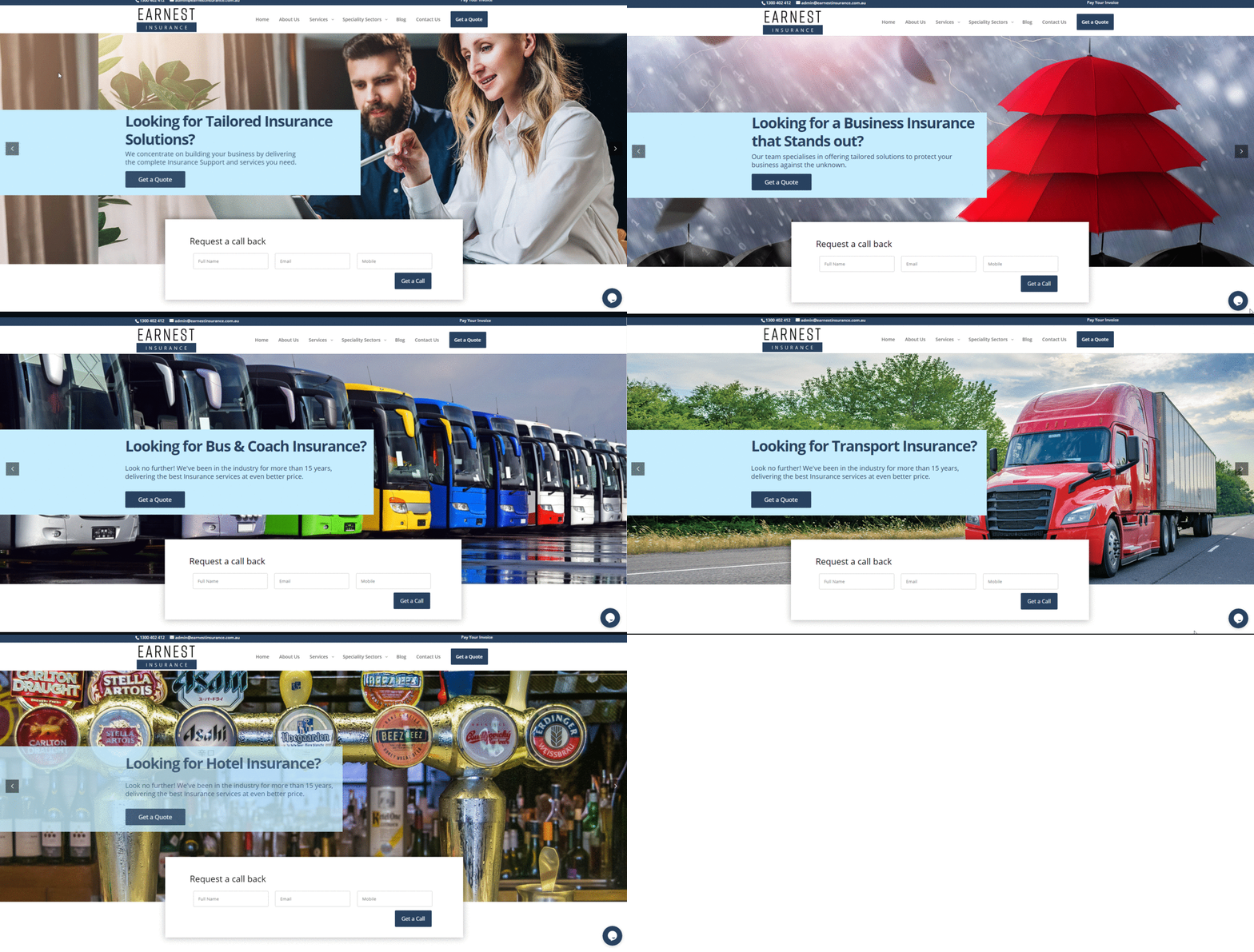
Look at the below wireframe, for example, it clearly specifies the different call to actions for different types of insurance. It smartly asks you what you want with the website or what your purpose is and gives you exactly the same. Professional website designers know where to place what elements to get the maximum clicks and hence help you with the same.
 Web design and development by Supersonic IT Digital
Stand Out from Your Competitors
Understanding your audience is a foremost step in creating a website that strives. If you understand your audience well, you will know what they are looking for or what need is left unfulfilled in the market.
The basic aim for any website is to sell its uniqueness and hence having a unique edge on your website would ensure that you have an edge over your competition. Consumers are tired of seeing the same lines, same benefits highlighted on every other website. Instead of taking inspiration from your competitors, dig deep and count on your unique selling point to attract and monetise more customers to your website.
Value Proposition
Consumer behaviour largely depends on value proposition and hence the value that you create for users is going to stay with them long after your product or service has diminished.
The decision-making process for consumers is largely dependent on their emotions and familiarity, hence having a website that one can remember will give them a value proposition that they can remember and recall later when needed.
The idea is not to change colours or patterns but to understand how changing a minor detail can affect and impact customers’ behaviour.
Optimise for Mobile
People now are using many more devices, other than their traditional desktops. Hence, optimising your website for all kinds of devices is a must if you want to capture your audience.
More specifically, if your website is such that it looks amazing on desktop but distorted on mobile phones or tablets- you should reconsider your choice of website design. Your website should be responsive enough that it performs well with all kinds of devices and does not take much effort for the user.
Optimising your website for mobile will also include monitoring the load time by minimising the image sizes, removing autoplay media, and using white space to evenly distribute the text and images and reduce the load time for the website.
Use a Human Voice/Images
Just as nobody likes talking to an emotionless robot, nobody likes seeing a faceless business. Businesses that have no human face and no human voice on their website tend to feel less trustworthy than the ones who have a human face and a human voice on their website.
Showing a human side for your company helps customers form a relationship with your brand and enable them to not hesitate while contacting your organisation.
This is not a mandate for design but with customers getting more and more conscious of their choices, it is essential to make your website such that it gives them an insight into your organisation and the work you do.
Ensuring or leveraging all these points on your website will help enhance its image and make it more customer-friendly. Overall, what works best for a website is to think from a customer’s perspective and add the elements that you then feel would make you stay on a website. Think about all the times you randomly opened a website and stayed there or purchased from there because the website was such that it impressed you or because the experience on that website was impeccable.
Now try and adapt the same for your website. A customer does not care if you use Helvetica or Calibri, what a customer truly cares about is how good an experience they are getting on your website or the fact that how their internal decision making is supporting or rejecting your website.
So, the crux of it is that you should invest in your web design and make sure that your website is designed in the best possible way to attract abundant customers and move your business to success.


